Ryze Design Studio
Last Updated:
4 min
read
TL;DR
The anatomy of a high converting website is the structure behind the page: hero, value proposition, explanation, proof, objections, CTA, hierarchy, friction, performance, and close. When these parts work together, the website feels clear, trustworthy, and easy to act on.
Why It Helps To Think In Anatomy
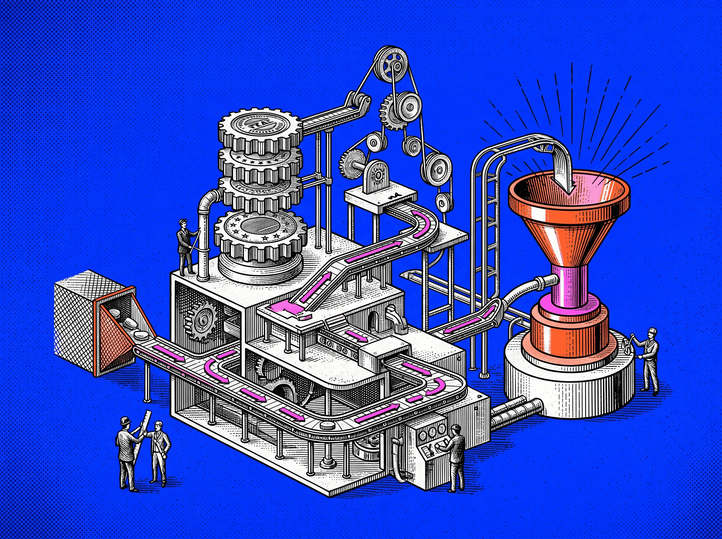
A high converting website is not a single thing. It is a set of parts working together. When you think in anatomy, the site becomes easier to diagnose. You stop saying, “the page is not working,” and start seeing where the problem actually lives.
A high converting website turns attention into action.
Maybe the first screen is unclear. Maybe the offer is buried. Maybe the page asks for action before it has earned trust. Maybe the form creates more effort than the promise is worth. These are different problems. They need different fixes.
This way of thinking also gives the team a shared language. Designers, copywriters, founders, and developers can talk about the page without falling into vague feedback. “The proof appears too late” is useful. “Make it stronger” is not.
A site improves when each part has a job. That is how you move from random changes to deliberate tests. Over time, the website becomes less like a brochure and more like a working system, one that helps people move from interest to action.
What “Anatomy” Means In A Conversion Context
In a conversion context, anatomy means the working structure of a page. It includes the visible sections people read and the hidden layers that shape how easy, fast, and safe the experience feels.
The working parts of a page, seen as a system.
A visitor is not simply looking at blocks on a screen. They are making small judgments. Do I understand this? Is it for me? Can I trust it? Is this worth my time? What happens if I click?
A good page helps those judgments happen in the right order.
Each Section Has A Job
Every section on a high converting page should earn its place. You should be able to point to any block and say what it does for the visitor and what it does for the business.
The hero section orients. The value proposition explains why the offer matters. The supporting explanation gives depth. Social proof lowers doubt. Objection handling answers resistance. The CTA gives the next step.
If a section has no clear job, it usually becomes noise. It may look good, but it weakens the decision path.
A simple test helps: scroll through your most important page and write one sentence beside each section. “This section helps the visitor understand X.” “This section proves Y.” “This section reduces fear about Z.” If you cannot name the job, the section probably needs to be cut, merged, or rewritten.
The Parts Need To Work As One System
A strong section cannot save a broken page. A sharp headline will not fix a confusing pricing table. Good testimonials will not fix a painful form. A beautiful layout will not fix a weak offer.
The page has to work as a sequence. First, it gives a clear promise. Then it explains the value. Then it proves the claim. Then it answers doubt. Then it makes the next step obvious.
When the parts work together, the page feels like one conversation. The visitor is not being dragged through a pitch. They are being helped through a decision.
A useful test: remove one major section from the page. If the story breaks, that section matters. If nothing changes, it was probably decoration.
Part 1: Above The Fold Section
The above the fold section is the first screen a visitor sees before scrolling. It carries more weight than its size suggests because it decides whether the visitor gives the rest of the page a chance.
People leave quickly when the first view is vague. They do not wait politely for the proof section, the FAQ, or the beautiful lower-page animation. The opening has to orient them fast.
The First Screen Should Orient The Visitor Quickly
The first screen has to answer three questions:
What is this?
Who is it for?
Why should I care now?
The first screen. It must orient fast.
This is not the place to be clever at the cost of clarity. A poetic line may feel interesting inside a brand workshop. A new visitor usually needs a plain sentence that tells them what the offer does and why it matters.
Someone landing from search, an ad, a referral, or a cold email should know within seconds whether they are in the right place. The faster the page gives that certainty, the more likely the visitor is to keep reading.
What This Section Usually Needs
Most strong above the fold sections contain a few basic pieces:
A clear headline that states the main outcome or value
A short supporting line that adds audience, method, or context
A primary call to action
A secondary call to action when a lower-commitment path is useful
A visual that supports the offer, such as a product image, short video, or clear illustration
The goal is not to fill the first screen with everything. The goal is to give the visitor enough to understand the offer and choose a next step.
If the page needs five explanations before the headline makes sense, the headline is doing too little.
Common Problems In This Area
Above the fold sections usually fail in predictable ways:
The headline could belong to any company in the category
The copy hides the benefit behind jargon
The CTA is missing, soft, or competing with too many other actions
The visual looks polished but does not explain the product or outcome
The copy talks about the company instead of the visitor’s problem
When the hero feels weak, start with the headline. Rewrite it so a stranger can understand it in three seconds. That one change often improves the whole page because it gives every later section a clearer job.
Part 2: Value Proposition Block
Once the visitor understands the basic offer, they need to understand why it is valuable. The value proposition block is where the page moves from “this exists” to “this might be useful for me.”
This section separates a real offer from a generic one.
The clearest reason to care.
The Offer Needs To Become Clear Fast
Founders often carry the full product vision in their head. They know the roadmap, the edge cases, the positioning, and the long-term plan. A visitor has none of that context.
The page has to compress the offer into something a person can repeat.
This block should clarify:
The main problem or opportunity you help with
The outcome you help create
The type of user, team, or business you serve best
You can write it as a short paragraph, a simple framework, or a small set of benefit cards. The format matters less than the clarity. A good value proposition makes the offer feel graspable.
If a visitor cannot explain the product after reading this section, the page is still too inward-facing.
This Section Should Answer Key Early Questions
Early in the page, visitors carry quiet questions. They may not phrase them directly, but they are present.
Common questions include:
Is this built for someone like me?
How is this different from what I already use?
Will this be hard to adopt?
What is the main benefit, not the feature list?
The value proposition block does not need to answer every detail. It needs to answer enough for the visitor to continue. Its job is to create relevance, not complete conviction.
A good test: after reading this section, the visitor should feel, “This understands my situation.” That is enough to move them into the next layer.
Part 3: Supporting Explanation Section
Once the offer is clear, the visitor needs depth. The supporting explanation section explains how the product, service, or process actually works.
This is where curiosity becomes understanding.
The section that turns interest into understanding.
Good Pages Deepen Understanding Without Losing Focus
The main danger here is bloat. Teams often use this section to unload everything they know: features, workflows, use cases, internal language, and product details that matter more to the team than to the visitor.
A stronger section stays focused on the path from current problem to promised outcome.
You might explain the steps of onboarding. You might show what the product does each day. You might describe how your service moves from audit to strategy to execution. The details should make the promise more believable.
Features need a reason to exist. Every feature should quietly answer, “so what?” Does it save time? Reduce risk? Remove manual work? Improve clarity? Help the team make a better decision?
If the feature cannot be tied to an outcome, it may not belong on the page.
Structure Matters Here
People scan before they read. Structure decides whether they keep scanning or give up.
This section can be organized in several clear ways:
A three-step path from setup to result
A set of themed columns such as “Plan,” “Build,” and “Improve”
Feature groups under problem-based subheadings
A short process view that shows what happens before, during, and after adoption
The important part is consistency. Once the visitor understands the pattern, they can move through the section without effort.
Confused structure creates cognitive load. Clear structure removes it.
Part 4: Social Proof And Trust Layer
Trust is not optional. A visitor may like the offer and still refuse to act if the page does not feel credible.
The social proof and trust layer answers the quiet question: “Why should I believe this?”
Evidence that others trust you.
Trust Needs To Appear Before Major Commitment
Proof has to appear before the page asks for meaningful action. A visitor needs more confidence before giving an email, booking a call, starting a trial, or sharing payment details.
This does not mean every proof point belongs at the top. It means the page should place the right proof near the moments where doubt naturally appears.
A small logo strip near a CTA can help. A customer quote beside a form can help. A security note near a signup step can help. Proof works best when it reduces the exact risk the visitor feels at that moment.
The job is not to impress. The job is to make the action feel safe.
What Belongs In This Layer
The trust layer can include:
Customer logos from recognizable or relevant companies
Testimonials with names, roles, and specific details
Case study metrics tied to real outcomes
Ratings from relevant review platforms
Security, compliance, or privacy signals where they matter
Screenshots or examples that show the product in use
You do not need every type of proof. You need the proof your audience cares about.
A startup selling to enterprise buyers may need security and implementation proof. A creator tool may need examples of work made with the product. A service business may need testimonials and case study outcomes.
Trust is specific. Generic proof feels thin.
The proof, signals, and details that reduce doubt.
Why Proof Timing Matters
If all proof sits at the bottom, many visitors never see it before leaving. If all proof sits at the top, it may appear before the visitor even understands the offer.
Strong page anatomy distributes proof where it belongs. A claim about speed should be followed by proof of speed. A claim about quality should be supported by examples. A claim about safety should be supported before the visitor reaches the signup or demo step.
Proof is not a decorative strip. It is part of the decision path.
Part 5: Objection Handling Section
Every serious buyer carries objections. They may worry about cost, effort, implementation, integrations, security, time, switching risk, or internal approval.
If the page does not address those objections, the visitor has to answer them alone. That usually means delay, doubt, or drop-off.
Answering resistance before it becomes drop-off.
Strong Pages Answer Resistance Points Before They Become Drop Off Points
Objections are rarely mysterious. They come up in sales calls, support tickets, onboarding notes, churn reasons, and customer interviews.
Good objection handling does not argue with the visitor. It treats the concern as reasonable and gives a clear answer.
For example, if buyers worry about switching time, the page can explain the onboarding process, typical timeline, and support provided. If they worry about cost, the page can explain value, usage, or payback. If they worry about team adoption, the page can show training, templates, or customer success support.
The tone matters. Do not dismiss the concern. Name it, answer it, and support the answer with proof where possible.
What This Section Might Include
Objection handling can appear in different forms:
A focused FAQ with real buying questions
Short sections built around common concerns
Comparison blocks that show the cost of staying with the old way
Implementation notes that make effort feel concrete
Security or compliance explanations for risk-heavy decisions
Keep the answers specific. “Easy to use” is not an answer. “Most teams launch their first workflow in under a week with our onboarding templates” is closer to useful, provided the claim is true.
This section is not for generic reassurance. It is for reducing real resistance.
Part 6: CTA Path And Decision Moments
Conversion is not one button. It is a path of small decisions that lead to one meaningful action.
Calls to action guide that path. They tell the visitor what to do when they are ready.
The route from interest to decision.
Conversion Is Usually Supported By More Than One CTA
A high-value page often needs more than one CTA. The first CTA appears in the hero for visitors who arrive ready. Another may appear after the value proposition. Another may appear after proof or objection handling. The final CTA closes the page.
These CTAs should not fight each other. They should support one primary conversion, such as booking a demo, starting a trial, or downloading a guide.
Secondary CTAs can help visitors who are not ready for the main action. “See Pricing,” “Watch Demo,” or “Explore Features” can keep the visitor moving without forcing a decision too early.
The key is hierarchy. One primary action. Supporting paths where needed.
The CTA Should Feel Earned
A CTA feels pushy when it appears before the page has created enough understanding or trust.
If you ask for a 30-minute call before showing value, proof, or fit, the visitor feels the cost first. If you ask after giving a clear promise, relevant evidence, and practical answers, the same CTA feels like a reasonable next step.
Review your pages with this question: has the page earned the ask at this point?
If not, add context before the CTA, move the CTA, or use a lower-friction action earlier in the page.
CTA Language Matters
Button copy should be clear, specific, and honest about what happens next.
“Submit” is almost always weaker than a phrase that reflects the visitor’s goal. Better options might include:
“Get My Free Report”
“Start My 14 Day Trial”
“Book A 20 Minute Demo”
“See The Pricing Plans”
The language should match the effort. A small download can use direct benefit language. A sales call needs clearer expectation-setting. If the next step involves a human follow-up, say so. If it takes two minutes, say so.
A good CTA reduces uncertainty. It does not just decorate a button.
Part 7: Visual Hierarchy And Scanning Support
Good copy still fails when the page is visually difficult to read. Visual hierarchy guides attention. It tells the visitor what matters first, what supports it, and where to go next.
A page with weak hierarchy makes people work too hard. Most will not.
The order in which the page guides attention.
The Page Should Guide Attention
Each screen should have a clear order of attention. The visitor should see the headline first, then the support copy or visual, then the action.
This order is shaped by size, spacing, contrast, alignment, and grouping. Important elements should not compete with decorative elements. Related elements should sit close together. Dense sections need enough room to breathe.
Good hierarchy does not require dramatic design. It requires restraint. The page should feel guided, not noisy.
When everything shouts, nothing leads.
Good Anatomy Is Easy To Scan
Most visitors scan before they read. They move through headings, short lines, visual anchors, and highlighted points. If the skim tells a coherent story, they may slow down and read more deeply.
Making the page easy to understand at a glance.
To support scanning:
Use descriptive subheadings that make sense without the paragraph below
Keep paragraphs short enough to enter easily
Use lists when comparison or sequence matters
Highlight key ideas sparingly
Use visuals only when they help explain or orient
A practical test: blur the page or step back from the screen. You should still see a clear pattern of emphasis. If every section looks equally dense, the page has no visual rhythm.
Part 8: Friction Reduction Layer
Friction is anything that makes the next step feel harder than it should. It may be a long form, a confusing instruction, a slow page, hidden pricing, unclear errors, or a signup flow with too many steps.
Not all effort is bad. Unnecessary effort is the problem.
Anything that makes progress feel harder.
Conversion Drops When Effort Feels Too High
Visitors constantly compare effort with expected reward. If the reward is clear and valuable, they will do more. If the reward is vague, even a small form can feel like too much.
This is why small frictions matter. One extra field. One unclear label. One surprise account creation step. One page that loads too slowly. Each adds weight to the decision.
The same logic applies beyond forms. Hiding basic pricing, forcing a demo for simple information, or making people search for security details can all create friction.
Friction says, “work harder.” Good conversion design says, “keep going.”
Strong Websites Remove Unnecessary Barriers
Friction reduction often looks simple:
Ask only for the fields needed at the first step
Explain why sensitive information is required
Make errors clear and easy to fix
Offer simple login or checkout paths
Keep CTAs visible and predictable
Make pricing, process, or next steps easy to find
Small details carry emotional weight. Autofill support, readable error messages, and clear confirmation screens tell visitors that the company respects their time.
That respect becomes part of trust.
Part 9: Technical And Performance Layer
The technical layer sits underneath the visible page, but it affects everything above it. A slow, unstable, or poorly responsive site can weaken even strong messaging.
Performance is not only a developer concern. It changes behavior.
How quickly the page becomes usable.
Speed Influences Behavior
Slow pages lose visitors before the offer has a chance to work. This is especially true on mobile, where attention is shorter and connections are less predictable.
Speed work usually includes:
Compressing and sizing images properly
Removing unnecessary scripts
Using caching and content delivery systems
Loading only what the page needs
Keeping animations and embeds under control
You do not need to chase perfect scores for their own sake. You need the page to feel quick enough that the visitor stays engaged.
A page that loads slowly starts the relationship with frustration.
Responsive Quality Matters
A website does not exist on one screen. People open links on phones, review pages on laptops, compare options on tablets, and send pages inside chat tools.
Responsive quality means more than fitting the layout into a smaller screen. It means the page still works as a decision path.
A page adapting clearly across screen sizes.
On mobile:
Text should remain readable without zooming
Buttons should be easy to tap
Forms should be simple to complete
Important sections should not disappear or move into confusing order
Visuals should support the message instead of crowding it
Review the page on the devices your audience actually uses. Any friction you feel there will feel larger to a real visitor.
Part 10: Reinforcement And Closing Section
The closing section is the page’s final turn. It brings the story back together and gives the visitor one more clear chance to act.
Some visitors read top to bottom. Some skim and jump to the end. Either way, the close matters.
The final summary and final ask.
The Page Should Close The Loop
By the bottom of the page, the visitor should know:
What you offer
Who it is for
Why it is credible
What happens next
The closing section should not introduce a new idea. It should compress the strongest points and make the next step feel obvious.
A good close gives the visitor permission to decide. It says, in effect: you understand the offer, you have seen the proof, and here is the next step.
Good Closing Sections Tend To Include
Strong closing sections often include:
A brief restatement of the main promise
A reminder of the most relevant benefits
One final proof point or customer quote
A clear CTA
A short note about what happens after clicking
Urgency can work, but only when it is real. Fake scarcity weakens trust. If the offer has limited onboarding slots or a real deadline, say it plainly. If not, rely on clarity instead of pressure.
The end of the page should feel calm and decisive.
How The Anatomy Changes By Page Type
The core anatomy stays similar across the site, but the emphasis changes by page type. A homepage, landing page, product page, and pricing page are not doing the same job.
Use the same principles. Do not force the same template everywhere.
Homepage Anatomy
A homepage usually serves several audiences and several intents. Its job is to orient quickly and route people toward the right deeper path.
The front door. It orients and routes.
A homepage usually needs to:
Keep the first screen broad but clear
Introduce the main value proposition
Show the most important audience or product paths
Use light proof with links to deeper case studies
Give visitors a clear next step without pretending the whole sale happens there
The homepage rarely closes the full decision. It helps people understand where they are and where to go next.
Landing Page Anatomy
A landing page has a narrower job. It usually supports one campaign, one audience, one problem, or one offer.
A focused page built for one audience, offer, or action.
That focus changes the anatomy. A landing page can:
Match the message from the ad, email, or source campaign
Spend more space on one specific problem
Use proof that speaks to that exact audience
Remove unnecessary navigation
Drive toward one primary CTA
A good landing page feels linear. It does not try to explain the whole company. It helps one visitor take one action.
Product Or Service Page Anatomy
Product and service pages sit closer to evaluation. The visitor is already interested enough to ask, “What exactly do you do, and is this right for me?”
These pages usually need:
A clear hero and value proposition
A deeper explanation of features, process, or deliverables
Proof tied to the specific product or service
Objection handling around implementation, fit, cost, and outcomes
CTAs that move the visitor toward trial, demo, or contact
These pages need balance. Too much education and the page becomes passive. Too much persuasion and it feels thin. The best versions explain and sell at the same time.
Pricing Or Demo Page Anatomy
Pricing and demo pages sit close to commitment. Visitors are comparing cost, value, risk, and next steps.
The page where value meets cost.
These pages need extra clarity around:
Plans, packages, or demo expectations
What is included and what is not
Contract terms, onboarding, or setup requirements
Trust signals and risk reducers
Objections around price, effort, and value
Confusion is expensive here. A visitor who cannot understand the cost or next step will often postpone the decision or choose a safer alternative.
The closer the page is to money or time, the clearer it has to be.
Common Mistakes In Website Anatomy
Weak pages tend to repeat the same mistakes.
Common problems include:
Asking one section to do too many jobs
Making the hero clever but unclear
Explaining features before the visitor understands value
Saving proof until too late
Hiding CTAs or making them visually weak
Ignoring objections
Treating mobile as a smaller version of desktop
Creating forms that ask for too much too soon
Letting visuals distract from the decision path
Most of these issues come from building the page as a collection of sections instead of a sequence of decisions.
The fix is simple, though not always easy. Name the job of each section. Remove what does not serve that job. Then arrange the parts in the order a real visitor needs them.
What High Converting Website Anatomy Usually Feels Like
A high converting website does not usually feel aggressive. It feels clear.
The visitor understands the offer without working hard. Proof appears before doubt gets too heavy. The next step is easy to find. The page respects time, attention, and risk.
From the outside, these pages often feel:
Easy to understand, even when the product is complex
Calm and focused
Honest about what happens next
Helpful at the exact moment questions appear
Built around the visitor’s decision, not the company’s internal structure
The anatomy is doing its job when people do not notice it. Each part supports the next. The page feels intentional, but not forced.
That is the quiet strength of a high converting website.
Final Takeaway
Thinking in anatomy turns website improvement into a practical exercise. Instead of guessing at design changes, you can inspect each part and ask what it is meant to do.
Does the first screen orient quickly? Does the value proposition make the offer clear? Does the explanation deepen understanding? Does proof appear before the ask? Are objections answered? Is the CTA path obvious? Is the page fast, responsive, and low-friction?
You do not need a perfect page on the first attempt. You need a structure you can improve.
Start with your most important page. Name the parts. Name the job of each part. Remove what does not help. Strengthen what does. Over time, the website becomes more than a polished presence. It becomes a reliable path from curiosity to confident action.
Make more clicks count
Traffic matters less when the page does not carry its weight. We design websites that guide attention, reduce doubt, and move the right visitors toward action.