

Have you ever scrolled past a website and instantly forgotten it… but couldn’t stop staring at a movie poster on the street?
It’s not a coincidence.
It’s not magic.
It’s design psychology—and the world’s best designers have been using it for decades.
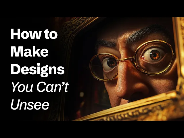
In my latest YouTube video, I break down five powerful secrets from iconic movie posters that can instantly transform your website from "meh" to mesmerizing. We're talking visual impact, storytelling through typography, imagery that speaks louder than text, color psychology, and flawless hierarchy—all packed into a 5-minute design masterclass.
🎥 Watch now: [Link to your video]
👀 Whether you're a designer, brand builder, or startup founder—this is design gold.
Here's what you'll uncover: ✅ Why Rosemary’s Baby and A Clockwork Orange are secret weapons for your homepage
✅ How Pulp Fiction’s fonts teach storytelling better than most blogs
✅ The single question to ask before choosing ANY image for your site
✅ How color made The Godfather feel dangerous before you saw a gun
✅ A real-world redesign example based on Andy Clarke’s movie-inspired website for a sustainable coffee brand
Oh, and if you're from India (like many of my awesome subscribers!), this content is especially curated with practical design takeaways for early-stage Indian brands and startups. Whether you're designing for wellness, D2C, or SaaS, these principles just work.
🎯 Perfect for:
UI/UX Designers
Founders and marketers in India and beyond
Anyone building high-conversion websites
Creators looking to infuse emotion into digital design
✨ Plus, I reveal one of the most impactful donation page layouts ever—inspired by movie trailers and designed to convert with emotion-first storytelling.
🔔 If you're tired of cookie-cutter templates and want to design like the top 1%, this is for you.


