Ryze Design Studio
Last Updated:
8 min
read

TL;DR
The strongest fintech products do more than look clean. They reduce anxiety, guide decisions, and make money tasks feel safe and understandable. Across these case studies, better UX improved onboarding, clarity, trust, and product adoption.
Fintech products live under a strange kind of pressure.
They have to feel simple while handling things that are not simple at all. Money, identity, trust, regulation, fraud, credit, transfers, approval flows, card controls, tax details, permissions, risk. A user opens the app wanting one small outcome, send money, open an account, check a balance, pay a bill, get a card, and behind that small outcome sits a system full of rules.
That is why UX matters so much in fintech.
In a retail app, bad UX can be annoying. In a fintech product, bad UX can feel risky. A confusing screen does not just slow people down. It makes them wonder whether the product is safe, whether their money is where it should be, whether the company understands what it is doing. Friction in fintech carries emotional weight.
The strongest fintech startups understand that. They do not treat UX as visual polish added after the product works. They treat it as part of the product itself. The interface is where trust gets built, where anxiety gets reduced, and where complexity either gets handled well or dumped onto the user.
Below are eight case studies that show how thoughtful UX can reshape a fintech product. The first three build on the examples already in your draft. The next five expand the article with more public examples from companies that have made design a visible part of how they operate.
1. Revolut: fixing onboarding drop-off before it becomes lost revenue

Revolut is a good reminder that growth leaks often begin inside the product, not outside it.
In a public product case study focused on Revolut's payroll onboarding, the design goal was direct: improve the percentage of users who successfully completed onboarding. The project identified a major drop-off around the “Add people” step and framed the redesign around reducing friction instead of blaming user intent. The stated KPI was to move onboarding conversion from 15.6% to 25%.
That setup matters because it reflects a classic fintech mistake. Teams assume a user dropped because the user was never serious. Quite often, the truth is harsher. The product asked for too much effort too early, or it asked for the right information in the wrong sequence.
The lesson from the Revolut example is not just “make onboarding shorter.” It is more specific than that. Good onboarding removes uncertainty at the exact points where people hesitate. It makes the next step feel obvious. It reduces the feeling that one wrong move will waste time or create paperwork.
In fintech, every extra field or poorly timed request carries weight because people are already cautious. They are handing over identity information, business details, payment credentials, or compliance data. That means the interface has to do two jobs at once: collect what the business needs and reassure the user that the path is still worth finishing.
When a team improves that balance, onboarding stops feeling like administration and starts feeling like progress.
2. Shine: designing for both speed and trust

Shine is one of the cleanest examples of onboarding done with range.
In Shine’s own UX write-up, the company explains the core challenge well. Their audience was not one narrow user group. It included younger freelancers as well as older professionals, which meant the onboarding experience had to feel modern without becoming cryptic, and reassuring without becoming stiff. The result, according to Shine, was an onboarding flow that reached an 80% conversion rate.
That number gets attention, but the more interesting point is why the experience worked.
Shine did not chase novelty for its own sake. It balanced clarity, friendliness, and compliance. That combination matters in fintech because design taste alone cannot rescue a flow that feels risky or vague. People need to know what is happening, why it is happening, and whether they are still on solid ground.
This is where many startups overcorrect. They either build something cold and bureaucratic in the name of seriousness, or they make it so playful that users stop trusting it with important decisions. Shine’s example shows the middle path. The UX can feel human and contemporary while still signaling competence.
That is a powerful lesson for fintech brands serving broad audiences. Simplicity is not about stripping everything down to the point of emptiness. It is about removing the type of effort that does not help the user move forward.
3. Cash App: proving that everyday finance wins on immediacy
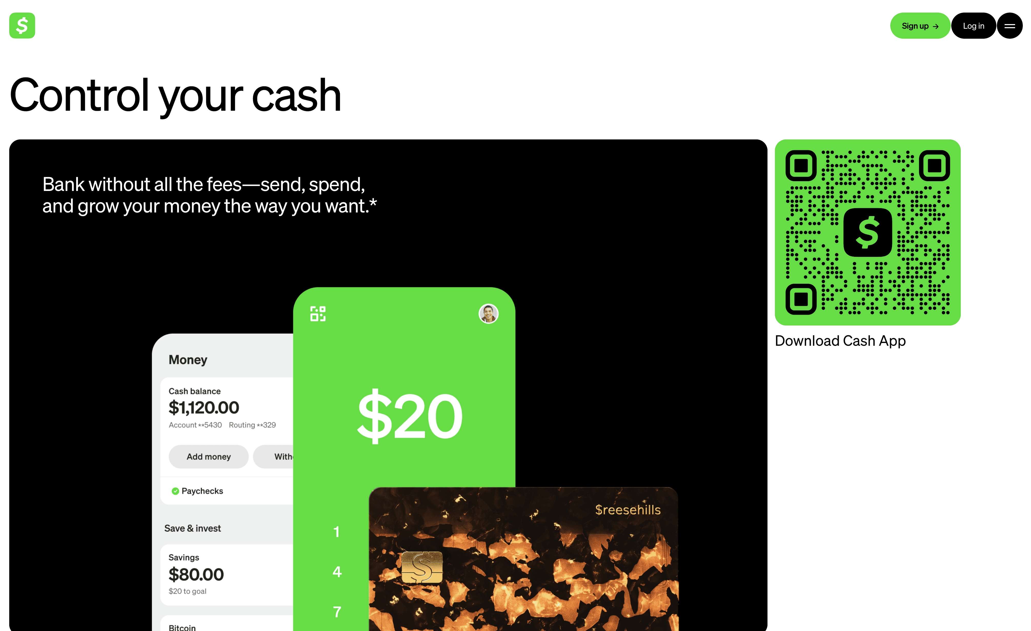
Cash App grew by making financial actions feel less ceremonial.
That sounds small, but it is not. Traditional finance products often wrap basic actions in too much structure. The product behaves as if every task deserves a mini procedure. Cash App moved in the other direction. It made sending, spending, storing, and interacting with money feel immediate.
Even outside formal case studies, that product choice is visible in how the brand and app experience have been built. At Block, Cash App sits inside a broader company focused on increasing access to the economy, and design leadership has been treated as a strategic function rather than a cosmetic one.
The practical UX lesson here is about reduction.
Users do not want a finance app to impress them with layers. They want it to make common actions feel easy enough that they stop thinking about the interface. When an app lowers the mental cost of checking a balance, requesting money, or using a card, usage becomes habitual. Habit is often the real growth lever.
Cash App’s broader influence on fintech UX comes from that shift. It helped normalize the idea that money tools could feel direct, visual, and behavior-driven instead of formal and intimidating.
4. Monzo: using growth design as a business tool, not a design department ritual
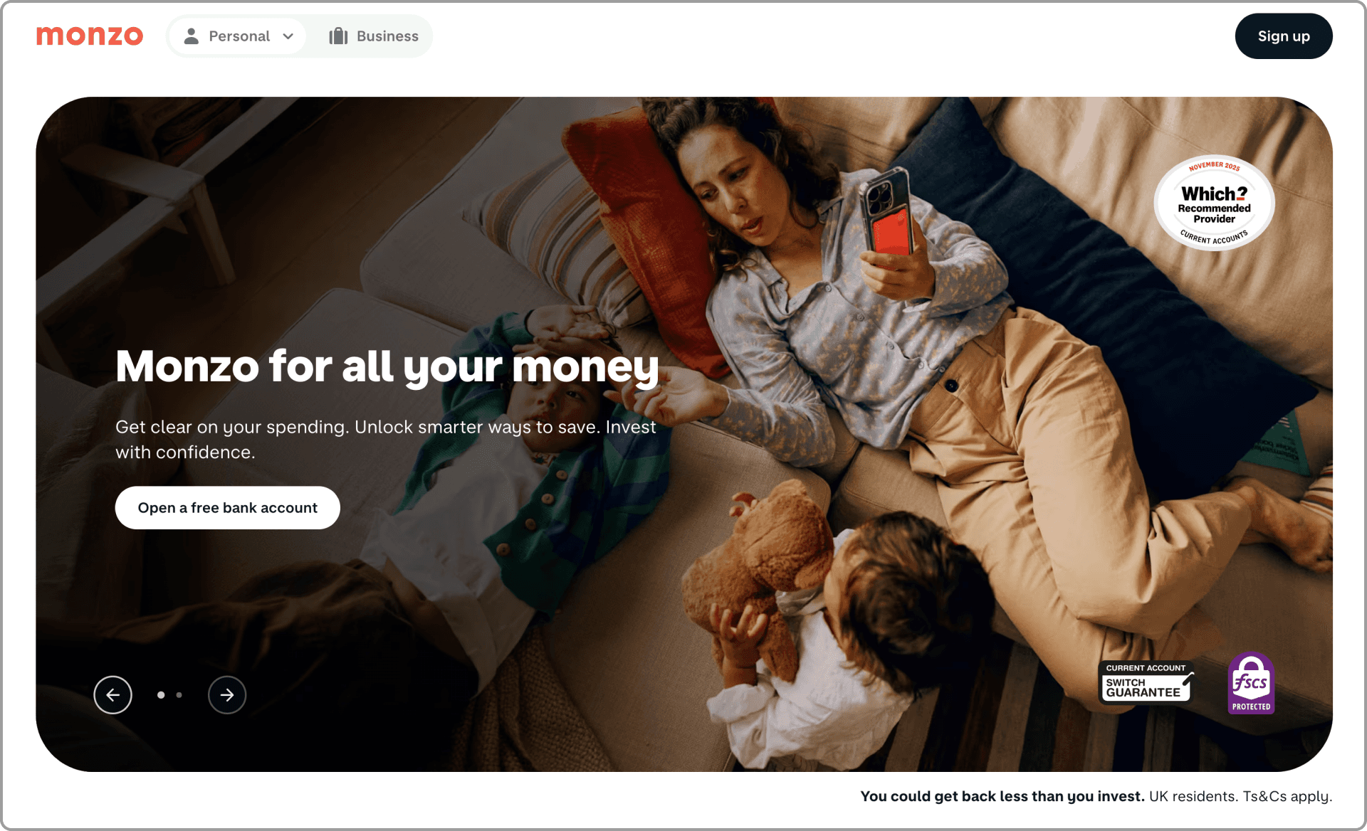
Monzo is a useful case because it talks openly about design in business terms.
In Monzo’s own writing on growth design, the company describes design as a business tool for growth and experimentation, not just a layer that makes features look better. In its annual report, Monzo also tied product improvements to customer growth, noting that 2.3 million people joined during FY2020 and highlighting app features such as Salary Sorter, Bills Pots, Get Paid Early, loans, overdrafts, and a savings marketplace.
That matters because many teams still separate “growth work” from “product quality” as if one is commercial and the other is craft. Monzo’s approach suggests the opposite. Better experiences can be the growth work.
A feature like Bills Pots is not just interface decoration. It is a behavioral design choice. It takes something that can feel abstract, setting money aside for future obligations, and makes it visible, named, and manageable. Features like that strengthen product understanding and usefulness at the same time.
The UX lesson from Monzo is that growth does not always come from louder acquisition. Sometimes it comes from making the product easier to trust, easier to understand, and easier to fit into real life. When design teams are allowed to test, learn, and influence core product decisions, that compounding effect becomes visible.
5. Nubank: reorganizing the interface around how people actually think about money
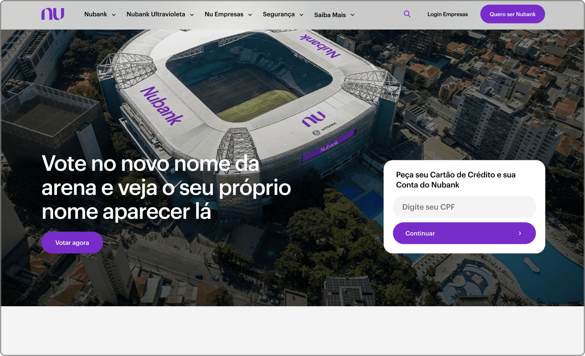
Nubank’s design writing is valuable because it shows the interface evolving alongside the product.
As the company expanded into a multi-product experience, the design challenge changed. The question was no longer how to make one product clear. It was how to keep a growing product ecosystem from turning into a cluttered mess. In Nubank’s public write-up on its “Tabs” redesign, the company says the new version of the app was designed to anticipate where customers expect to find information and what they want to do, based on three distinct mental models of managing financial life.
That sentence gets at the heart of mature fintech UX.
A finance app is not only a collection of tools. It is also a map of priorities. If the structure reflects the company org chart instead of the user’s mental model, the app becomes harder to navigate every time the business adds another product.
Nubank also frames design as part of its scale story. On its design archive, the company refers to design’s role in simplifying finance for over 110 million customers in Latin America. That scale raises the stakes. When a product serves that many people, information architecture is not a tidy design exercise. It is operational.
The lesson is simple. As fintech startups grow, the interface cannot just get bigger. It has to get more legible.
6. Wise: making a global money product clearer, more accessible, and more consistent
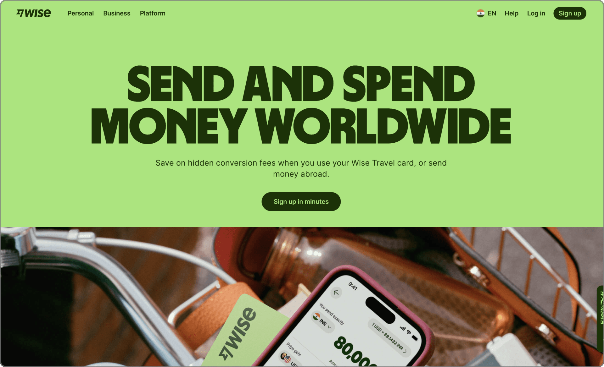
Wise is a strong case study because it treats clarity as a design system problem, not just a copy problem.
In Wise’s design materials, the team describes a mission to make the experience look, sound, and work consistently for people everywhere. In the public launch of its updated design system, Wise says it set a goal to be as universally accessible as possible, serving more people, in more places, and in more product environments. It also notes that the company had grown to over 16 million customers.
That intent shows up in practical decisions. Wise redesigned icons to be simpler and more globally understandable, refreshed its visual language, and focused heavily on accessibility. In another public write-up, the team explains that it adopted type systems with broad language support, simplified iconography, increased contrast, reduced clutter, and strengthened focus states and input visibility.
This is important because international fintech products face a different kind of UX challenge. They do not just need a clean UI. They need a UI that survives cultural context, translation, accessibility requirements, device conditions, and a wide range of user familiarity.
The Wise example shows how good UX matures. At first, a startup may win by offering a smarter product. Later, it wins by making that product easier to understand across more markets without losing coherence.
Consistency is not boring in that setting. It is what allows trust to scale.
7. Klarna: reducing checkout friction without making the flow feel fragile
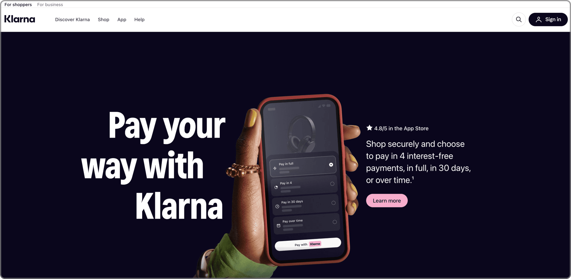
Klarna sits at the intersection of payments, identity, and merchant experience, which makes checkout UX especially important.
In Klarna’s official mobile SDK documentation, the company emphasizes that its native integrations are built for a seamless in-app experience and explicitly points to features such as remembering returning customers, device-wide login, passkey support, application redirects back into the app, and camera access for ID verification. The documentation also states that these
capabilities are designed to improve conversion and reduce friction.
That is a useful fintech example because checkout friction often hides in transitions.
A user starts in one app, gets pushed into another for bank verification, returns to the original context, signs in again, confirms identity, and hopes nothing broke on the way. Every handoff is a chance for doubt, delay, or abandonment.
Klarna’s approach highlights a broader UX principle. In fintech, you do not reduce friction only by deleting steps. Sometimes you reduce friction by making unavoidable steps feel connected, expected, and safe.
That is subtle work. The user should not feel the plumbing. They should feel continuity.
8. Mercury: tailoring the experience to role, workflow, and business stage
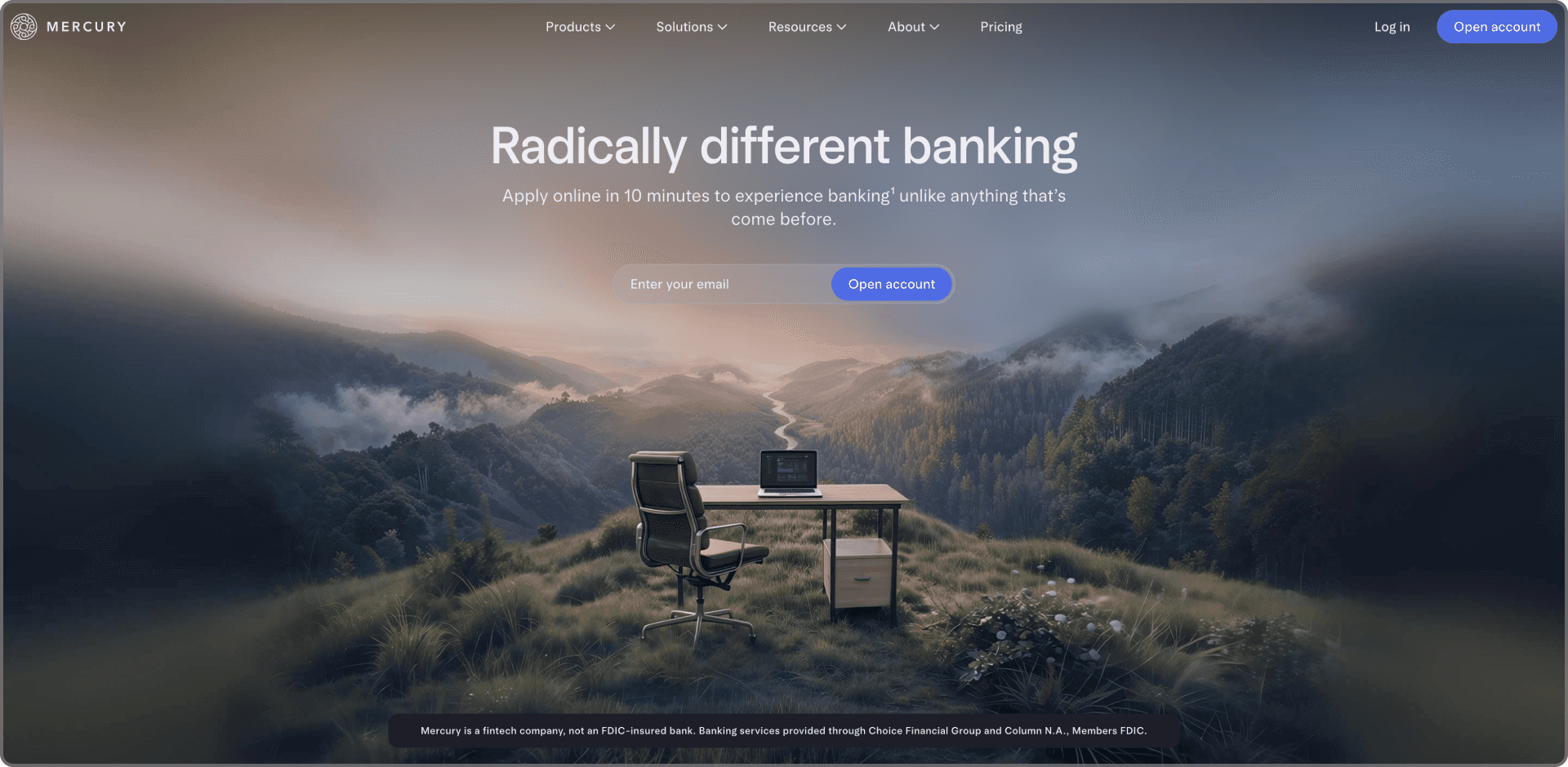
Mercury is a good example of fintech UX that goes beyond onboarding screens and into product relevance.
On its site, Mercury describes a modern banking experience for businesses and says users can apply in 10 minutes. In Mercury’s own blog, the team argues that personalization should shape onboarding, in-app education, announcements, and follow-up guidance based on user role, industry, permissions, and product behavior.
That matters because business fintech products often fail in a specific way. They give every user the same product education even when those users have very different goals. A founder, an accountant, and an operations lead may all enter the same system, but they do not need the same first-run experience.
Mercury’s framing points toward a better model. Use the interface to show the right value to the right user at the right moment. Not in a creepy way, not in a noisy way, but in a way that respects context.
That is especially important in finance software, where feature depth can become feature fog. Personalization, when done well, helps the product feel more competent because it surfaces relevance instead of forcing users to dig.
What these case studies really show
These companies are different in audience, geography, product scope, and business model. Still, a few patterns repeat.
First, strong fintech UX reduces emotional friction, not just interaction friction. It lowers doubt. It makes the next step feel safe.
Second, the best teams design around mental models, not internal complexity. Users do not care how many squads or systems sit behind a screen. They care whether the product makes sense.
Third, good design scales better than patchwork. As fintech startups expand into new features, markets, and user groups, the interface has to become clearer, not just fuller.
Fourth, UX is one of the few places where brand, product, and growth actually meet. A better flow can increase conversion. A better structure can increase retention. A clearer product can improve trust. In fintech, those are not side benefits. They are the job.
Thoughtful UX is not optional, it is infrastructure
Fintech founders often talk about compliance, risk, unit economics, fraud, and distribution. Fair enough. Those matter. But the user meets all of that through the product experience.
That means UX is not the wrapper. It is the operating surface.
A startup can have real technical depth, clever financial mechanics, and a sharp market angle, then still lose users because the product feels confusing at the exact moment trust should be strongest. The opposite is also true. A product that makes difficult things feel manageable can earn disproportionate loyalty.
That is what these case studies point to.
In fintech, design is not there to make the interface attractive after the serious work is done. It is part of the serious work.
Design Builds Trust
We design fintech experiences that reduce friction, improve onboarding, and make complex financial products feel clearer, safer, and easier to adopt for real users.