Ryze Design Studio
Last Updated:
7 min
read

TL;DR
Minimalism is not about making a brand empty. It is about removing what weakens the message and strengthening what remains. Apple’s system worked because product, packaging, typography, and communication all followed the same logic.
Minimalism gets misunderstood a lot.
People often talk about it as if it means taking things away until a brand becomes cold, blank, and interchangeable. A white background. A thin sans serif. Too much empty space. A logo that looks like it was sanded down by committee. You can see why some people get tired of it. But that is not real minimalism.
Good minimalism is not about saying less because less looks fashionable. It is about deciding what matters enough to stay visible. It is an editing discipline. It asks a brand to stop hiding behind decoration and make a cleaner argument. That is why the best minimalist brands do not feel empty. They feel deliberate.
Apple is one of the clearest modern examples of this shift.
Its branding did not begin minimal. The company’s earliest visual language was more literal, more decorative, and more rooted in a different era of personal computing. Over time, Apple moved toward a leaner identity, a more disciplined visual system, and a product presentation style that made restraint feel premium rather than quiet.
That evolution matters because it shows what minimalism can do when it is tied to product truth instead of trend chasing. Apple did not become recognizable by making itself generic. It became recognizable by making fewer things compete for attention.
Background: Apple’s evolution
Apple’s early branding looked like a company still searching for its center.
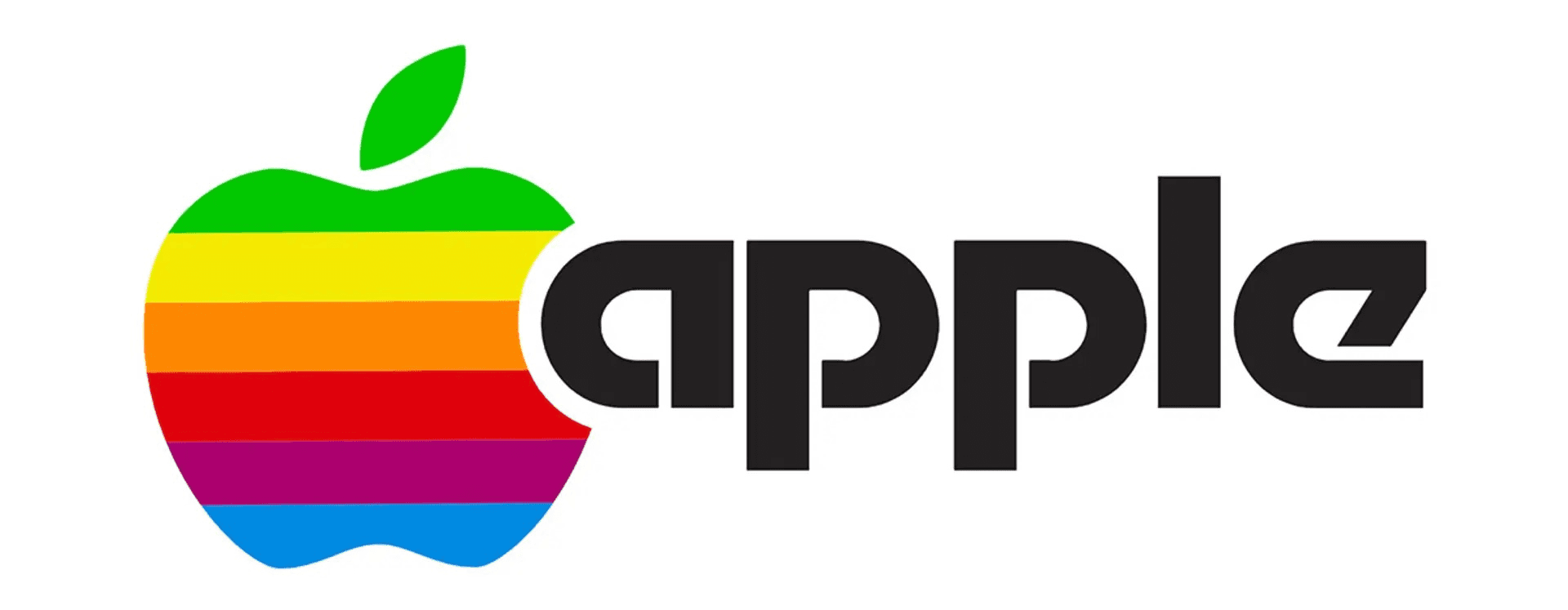
The original logo was elaborate. The rainbow-striped apple that followed became iconic, but it also belonged to a particular chapter in computing, a moment when color itself was a technical statement.
As Apple’s products matured and the company pushed toward a more refined product experience, the brand language changed too. The logo became more adaptable, more monochrome, and easier to place across products, packaging, and advertising contexts. Apple’s own San Francisco typeface later reinforced the company’s preference for a consistent, legible typographic voice across products.
That shift was not just cosmetic.
Apple was moving toward a brand expression that mirrored what it wanted the products to feel like: clear, composed, precise, and modern without being fussy. The visual system started to act less like decoration and more like interface. It guided attention. It created hierarchy. It left room for the product to hold the scene.
This is one reason Apple became such a reference point in branding conversations. The company did not simply choose a cleaner look. It built a world where that cleaner look was repeated with enough discipline that it turned into identity.
The problem before minimalism
Before a minimalist system fully took hold, Apple faced a branding problem many growing companies know well. Different materials can still point to the same company while making it feel less coherent.
There were three pressure points in particular.
Crowded branding
When packaging, promotion, retail presentation, and product storytelling are not aligned, the brand can feel unstable. The user may still recognize the company, but recognition is not the same as clarity. If every touchpoint uses a different visual volume, the brand begins to feel noisier than it needs to be.
Minimalism helped Apple solve that by creating a more repeatable visual structure. A controlled palette. Strong product photography. Clean surfaces. Limited copy. Intentional spacing. These are not glamorous decisions on paper, but together they make a brand feel more resolved.
Overly technical messaging
Technology companies often make the same mistake when they grow. They assume more features should produce more explanation. That instinct is understandable, but it can create language that is heavy, jargon-filled, and disconnected from what customers actually care about.
Apple moved the other way. Instead of forcing the audience to admire complexity, it framed products through experience, feeling, and benefit. The copy became sharper. Headlines carried more weight. Visuals did more of the persuasion. That is a minimalist move in writing as much as in design. You stop narrating every internal detail and let the strongest promise lead.
A logo and system that needed broader range
A logo is never just a logo once a company starts scaling. It has to work on hardware, packaging, websites, events, print, operating systems, advertising, and products that may not even exist yet.
A simpler visual identity gave Apple more room to do that cleanly. The mark became more versatile. It could recede when needed or act as a premium signal when placed sparingly. It did not need extra styling to carry weight.
That is one of the less discussed strengths of minimal branding. It travels better.
Embracing a minimalist overhaul
Apple’s move toward minimalism worked because it happened across the system, not in one isolated update.
A brand does not become minimalist because it changes the logo file. It becomes minimalist when product, packaging, copy, photography, interface, retail, and motion all start obeying the same logic.
Packaging simplicity
Apple’s packaging became one of the clearest expressions of its brand philosophy.
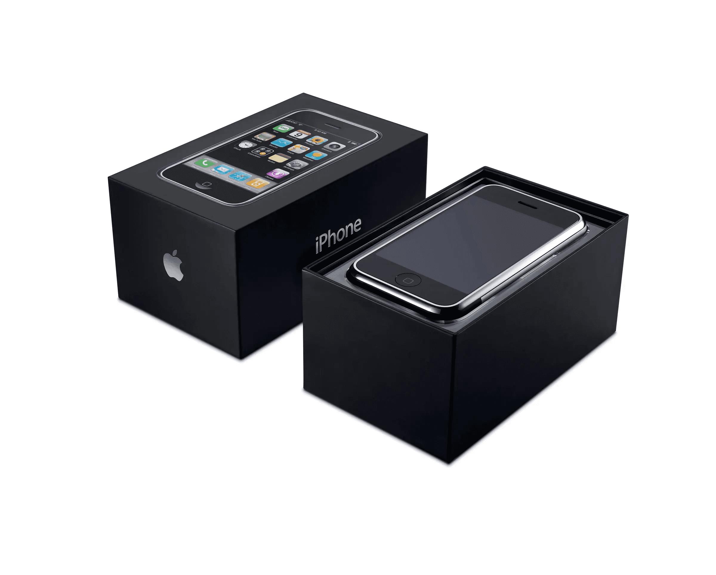
The box stopped behaving like a salesman. It stopped shouting features from every side. It stopped trying to win attention through clutter. Instead, the product became the focal point. Clean surfaces, limited text, strong image placement, and careful spacing created a feeling of control.
That feeling mattered. Packaging is often the first physical handshake a customer has with the product. If the box feels considered, people assume the product inside has been considered too. That may sound irrational, but branding works through signals like this all the time.
Minimalist packaging tells the customer, “Nothing random happened here.”
Apple used that signal well.
Whitespace-focused marketing
Whitespace is one of those design concepts that gets repeated so often it starts to sound mystical. It is not mystical. It is just space used on purpose.
Apple’s marketing makes this easy to see. Large areas of white or black background are not there because the brand had nothing else to add. They are there because the company wants your eye to land exactly where it intends.
That restraint changes how the audience reads the work. A crowded ad asks the viewer to sort, scan, and prioritize. A sparse ad does some of that work for them. The message becomes easier to grasp because fewer elements are competing for attention.
Whitespace also creates confidence. Brands that fill every inch often feel anxious, as if they are afraid the user will leave unless given one more reason to stay. Minimalist brands project the opposite mood. They behave like they know the product can hold attention.
Clean typography and a tighter visual voice
Typography is one of the quietest ways a brand teaches people how to feel about it.
Apple’s typographic choices supported legibility, consistency, and calm. The company’s current San Francisco typeface is described by Apple as providing a consistent, legible, and friendly voice across its products. That language matters because it aligns with what minimalist branding should do. It should reduce unnecessary friction, not add style for style’s sake.
A strong minimalist brand usually uses type with discipline. Not because decoration is forbidden, but because the brand wants hierarchy to do real work. Headline, subhead, body, caption. Each level should earn its place. Each decision should make the experience easier to navigate.
This is where many brands get minimalism wrong. They remove color and imagery but forget to strengthen the structural elements that help people read and understand. Apple’s system works because it does both.
Product-first presentation
One of Apple’s sharpest branding decisions was making the product the hero.
That sounds obvious now, but plenty of brands still do the reverse. They pile effects, supporting graphics, and promotional framing around the thing they are trying to sell. The product becomes one more object in a crowded composition.
Apple’s minimalist system creates room for the product to carry the story. A device can sit in a simple frame and still feel desirable because the surrounding system is not competing with it. That is not only a visual choice. It is a statement of confidence.
Minimalism, at its best, makes room for conviction.
Results: the impact of “less is more”
Apple’s use of minimalism changed more than aesthetics. It shaped how the company was perceived.
Global recognition
A simpler, more consistent identity becomes easier to remember.
Apple’s visual language reached the point where very little was needed for recognition. A silhouette. A product shot. A piece of packaging. A sparse homepage. The signals were strong because they were repeated consistently and stripped of avoidable noise.
That kind of recognition is difficult to build and easy to underestimate. A brand does not earn it by being plain. It earns it by being distinct in a disciplined way.
Premium perception
Minimalism helped Apple look expensive, but not in a flashy luxury sense.
The premium signal came from control. Nothing looked accidental. Nothing felt overloaded. The simplicity suggested precision. The restraint suggested confidence. The product presentation suggested that details had been resolved before the customer ever arrived.
That is one reason minimal branding often works well in premium categories. It communicates care through what it refuses to clutter.
A more unified user experience
The strongest brand systems are not trapped in marketing. They extend into the product experience itself.
Apple’s minimalist logic showed up across packaging, interfaces, hardware presentation, and communication. That consistency matters because it reduces the psychological reset customers have to perform from one touchpoint to the next.
A person moves from ad, to website, to box, to device, to OS. If the experience feels like one brand mind was responsible for all of it, trust deepens. The customer does not need to keep reinterpreting the company.
That is not a small outcome. It is one of the reasons brand consistency has real commercial value.
Why Apple’s minimalism worked when weaker versions fail
A lot of brands copy the surface of Apple’s style and miss the machinery underneath.
They remove color, flatten the layout, add more whitespace, and assume they now look premium. Usually they just look unfinished.
Apple’s version worked because it had support underneath the visuals.
The products themselves were central to the story.
The copy became clearer, not emptier.
The packaging, retail, interface, and campaign design were aligned.
The restraint was disciplined, not lazy.
That distinction matters. Minimalism only works when the remaining elements are strong enough to carry meaning. If the photography is weak, the copy vague, the hierarchy sloppy, and the product positioning unclear, “less” simply exposes the weakness faster.
In that sense, minimalism is unforgiving. It removes hiding places.
That is exactly why it can be so powerful.
Key takeaways
Consistency is not glamorous, but it compounds
Apple shows how repetition, when handled with discipline, becomes equity. The same principles repeated across product families and touchpoints create memory. Over time, that memory becomes trust.
Whitespace is a strategic tool, not an aesthetic costume
Space works when it directs attention and creates calm. It fails when it exists only to imitate a trend. Minimalism should always make the message easier to read.
Simple does not mean generic
A minimalist system still needs character. Apple found that character in proportion, restraint, material quality, tone, motion, and product focus. Brands that remove clutter without strengthening identity usually end up forgettable.
Editing is part of branding
One of the biggest lessons here has nothing to do with Apple specifically. It is that strong brands know what to leave out. Not because they are timid, but because they know attention is finite and meaning gets diluted when everything is treated as important.
What this means for modern brands
Not every company should try to look like Apple. That would be a fast route to bland sameness.
But many brands can learn from the logic behind Apple’s minimalism.
If your message feels scattered, minimalism may help sharpen it.
If your packaging is doing too much, minimalism may help the product stand taller.
If your website feels busy, minimalism may help users find the main path faster.
If your brand voice is overloaded with explanation, minimalism may help the strongest idea breathe.
The deeper question is not “Should we look minimal?”
It is “What is our brand trying to make obvious, and what is currently getting in the way?”
That is a better starting point because it keeps the conversation rooted in clarity, not style mimicry.
Final thought
Apple’s story shows that minimalism is not a decorative trend sitting on top of branding. It is a method of concentration.
It asks a company to become harder to distract from.
By stripping away visual noise, tightening language, and repeating a coherent system across touchpoints, Apple turned restraint into one of the most recognizable signals in modern branding. That did not happen because the company used less for the sake of looking refined. It happened because the brand learned how to make fewer elements carry more meaning.
That is the real power of minimalism.
Not emptiness.
Precision.
Clarify Your Brand
Strip away noise, sharpen what matters, and build a brand system that feels premium, coherent, and easier to recognize across packaging, web, product, and campaigns.