
How to Start Building Your Website When You Feel Stuck: Our Award-Winning Process
We've all been there—staring at a blank Figma artboard, feeling the pressure of creating the perfect website. When it's your own brand on the line, that pressure multiplies. At Ryze Design Studio, we faced this exact challenge when building our own website, and the blank canvas paralysis nearly stopped us before we started.
Why Starting From Scratch Feels So Intimidating
The beginning is always the hardest part. When creating our design studio website, we found ourselves:
Endlessly collecting inspiration without implementing anything
Overthinking every small decision ("Is this font really representing our brand?")
Getting lost in details before establishing the basics
Feeling the pressure to create something remarkable since we're a design studio
Sound familiar? This pattern keeps countless websites stuck in the planning phase forever.
Breaking Through: Define Purpose Before Pixels
We finally gained momentum when we stepped back from design tools completely and focused on answering one question:
"What does this website need to accomplish for our business?"
For our studio, the goals were clear:
Demonstrate our design expertise through the site itself
Present our services in an engaging, easy-to-understand way
Create clear pathways for potential clients to contact us
Ensure intuitive navigation regardless of device
This simple exercise created immediate clarity. Every subsequent decision had a clear benchmark: "Does this support our core business goals?"
The Framework That Unstuck Our Process
After establishing purpose, we implemented a structure-first approach:
Start with real content: We wrote actual copy instead of relying on placeholder text, which forced us to confront the real information architecture challenges
Wireframe for flow: We sketched basic layouts focusing only on user journey before any visual design
Design in grayscale: We created the entire site in black and white first to ensure strong structure and hierarchy
This counterintuitive approach—particularly designing without color initially—was transformative. It prevented us from hiding weak layouts behind attractive colors and forced us to solve structural problems first.
The Two-Phase Tool Approach
Another realization that accelerated our progress was using the right tool for each phase:
"We used Figma for all creative exploration—it gave us freedom without technical constraints. Once designs were finalized, we implemented everything in Framer, which made adding interactions remarkably straightforward."
This separation prevented technical considerations from limiting creativity in the early stages while ensuring efficient implementation later.
Knowing When to Launch (Despite the Never-Ending To-Do List)
Perhaps the most valuable lesson was establishing clear launch criteria:
Core sections supporting primary business goals: ✅
Navigation working intuitively across devices: ✅
Real (not placeholder) content in place: ✅
Basic user testing completed: ✅
Analytics implemented: ✅
When these fundamentals were in place, we launched—despite having numerous "nice-to-have" features still planned. This decision was crucial to breaking the perfectionism cycle.
The Results Speak Volumes
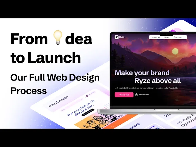
The outcome was better than we anticipated—not only did our site start generating client inquiries immediately, but it also received an Awwwards nomination. The irony wasn't lost on us: by focusing less on perfection and more on purpose, we created something that ended up being recognized for its excellence.
See Our Complete Process
We've condensed months of learning into this article, but in our detailed video walkthrough, we show exactly how we applied these principles—including all the messy middle parts, specific design decisions, and technical implementations that transformed our concept into an award-nominated website.
See the final result at ryzedesigns.com, or reach out at connect@ryzedesigns.com if you're facing similar challenges with your own website.


